Individual energies
You can view the individual meters and buildings in the respective energy tab. You can choose from several types of charts, depending on which one is best suited for your situation. You can choose from the following options:
- Total consumption
- Monthly consumption
- Comparison chart
- Pie chart
- Heat map
We will now discuss each of these chart types individually. Since most of the elements used to set up the chart display are common to all types, we will show them all in detail in the following example with Total Consumption.
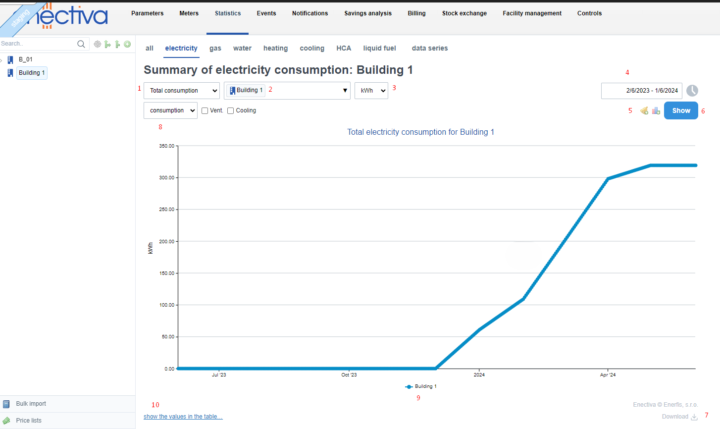
Total consumption
This graph shows the consumption of the meter or building in an increasing curve. This type of graph best shows the change in the upward trend of consumption (cost) as the curve is steep or flat.
In the following example, we show the total consumption of the building "BUILDING 1", where we will describe all the elements you can set to plot the right graph. These parameters are common to most other graphs.
-
Choose between total consumption, monthly consumption, comparison chart and pie chart and heat map.
-
At the building or complex level, you can choose to display the sub-meters that belong hierarchically to the building or complex. In our example, at the building level "BUILDING 1" you can choose to display statistics not only for the building as a whole, but also for individual tenants or meters. You can also display consumption together with data series, for example consumption depending on outdoor temperature or depending on one product produced (in the case of a factory).
-
You can choose the unit that suits you
-
Here you can select for which time period you want to view statistics. In addition to setting the time range, you can also enable the hourly filter by clicking in the multiple options box to see only the consumption in the selected time range. You can also use the comparison with the previous year, which will show two graphs - one for the current year, the other for the previous year.
-
Here you can set up new alerts or set up a chart to be sent to your email.
-
After you have set all the necessary chart parameters, click the View button. If you change the parameters after you have already displayed the chart, you must click this button again for the changed parameters to take effect.
-
Use the Download button to export the chart to XLSX or PDF.
-
Here you can select Cost box to see the cost in CZK for the energy consumption you are viewing. Data for this statistic is primarily drawn from invoices issued. In case there are no invoices for the selected time period, enectiva will use the data directly from the entered data to calculate the cost, from which it will calculate the final cost after multiplying the energy by the price. It is therefore necessary to set the price list of the meter that currently shows the consumption. At the same time, you can display the outside temperature, dayrates or any discrete or continuous data series together with the energy consumption, or you can also include in the graph the energy consumed for ventilation and cooling (in the case of electricity), DHW ( in the case of water) and ventilation and DHW (in the case of heat).
-
Graph curve. In case of displaying several charts at once, it is possible to view/hide the curve by clicking on the chart name at the bottom of the chart.
-
Option to display relevant data in a table.
Monthly consumption
This consumption (cost) display is the best option if you want to display consumption or costs defined by a time period. Monthly consumption does not mean a month in the calendar, but a period of time. For example, if you select a period as in the example below (1/2/2024 to 1/5/2024) - you will see bar charts for the months that fall within that period.
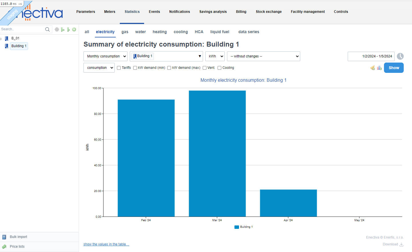
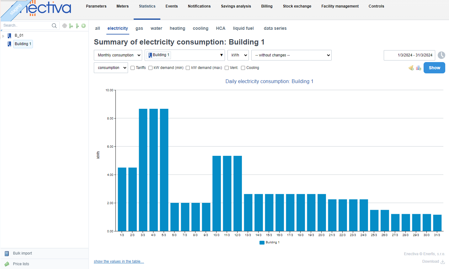
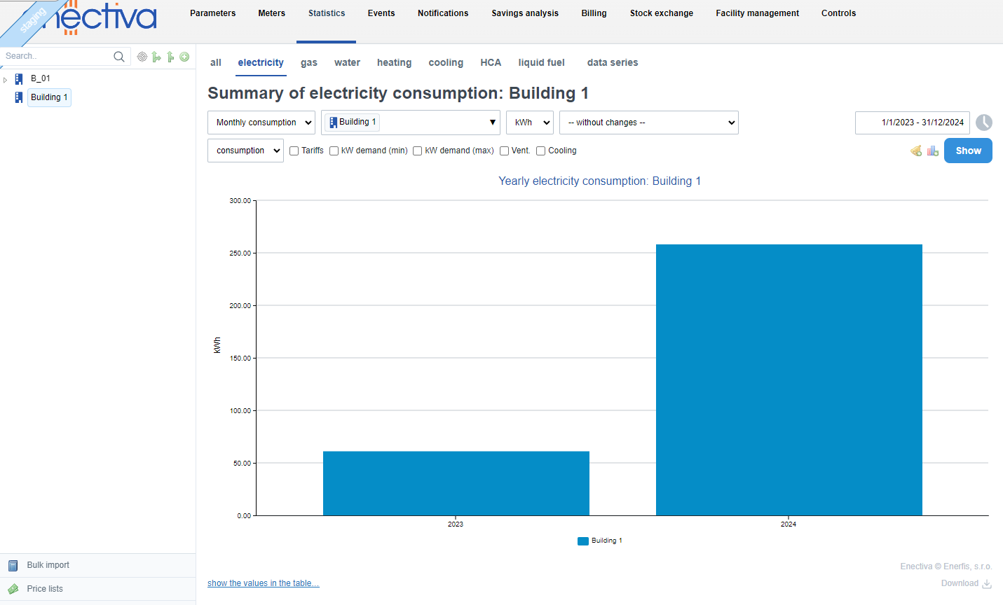
You can easily change the time periods displayed by clicking on the columns or outside columns in the displayed chart. Referring to the chart above:
Clicking on a column representing a month will open a bar chart for the days in that month (in this case March):
On the other hand, clicking outside the column in the chart area will increase the time span on the chart for years (previous and current year will be displayed):
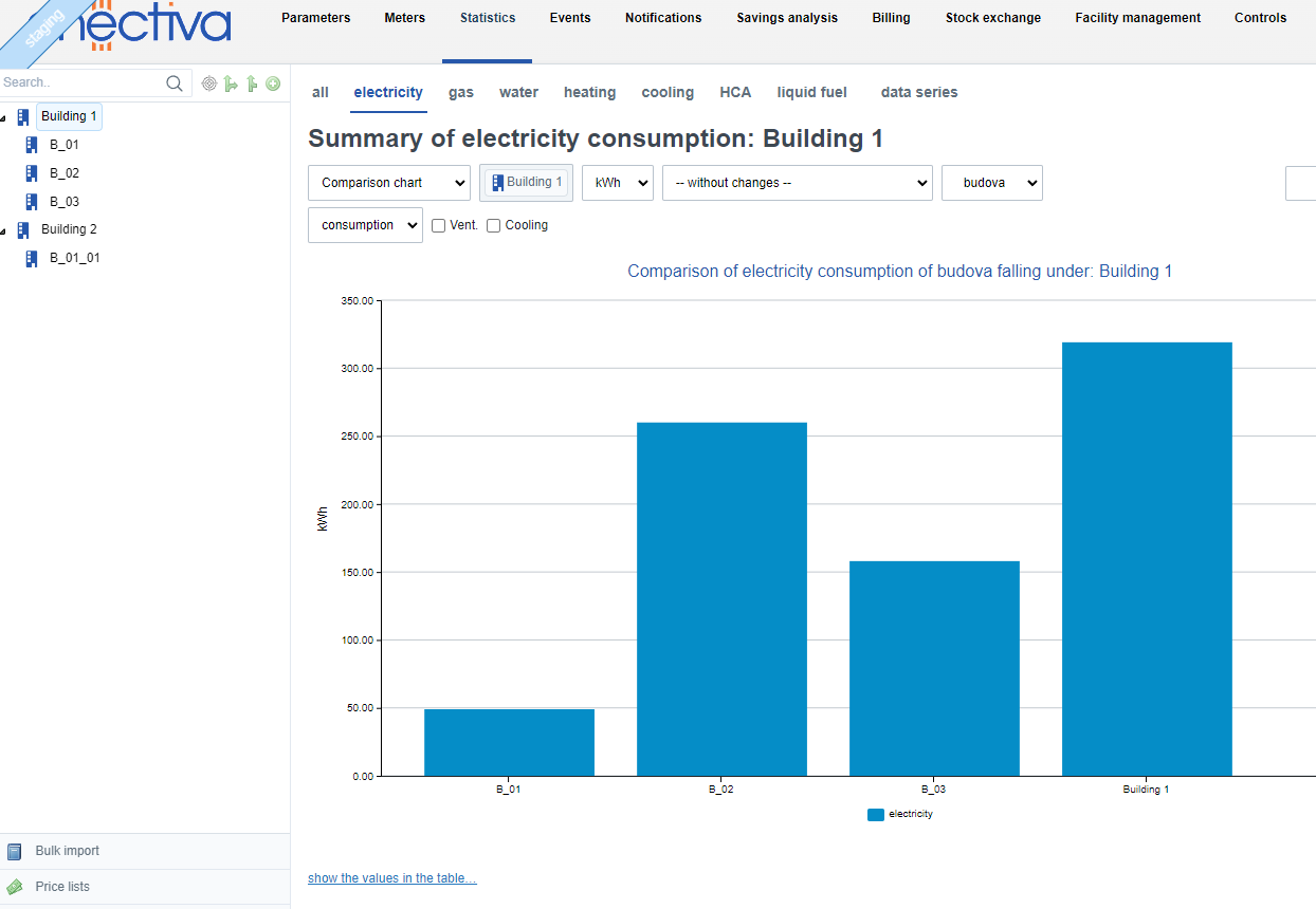
Comparison chart
If you wish to compare consumption/costs between different entities under a given entity, select the Comparison Chart option. In our example, the consumption of "BUILDING 1" will be displayed along with other buildings at the same entity level (in this case, B_01, B_02, B_03).
Pie chart
The pie chart displays how individual entities contribute to the total consumption or costs. Each slice represents a part of the whole (an entity or an entity type), and its size corresponds to its share.
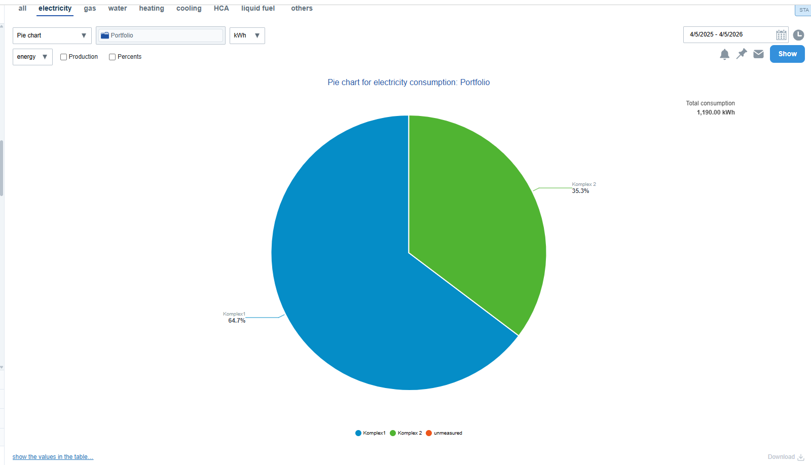
Navigation (Drilldown)
The chart is interactive and allows you to explore the entity structure in more detail:
- Click on a slice to drill down to a lower level
- Click outside the pie chart to go one level back
- The view alternates between:
- aggregated data by entity types (e.g. buildings, technologies)
- specific entities (e.g. Building A, Building B)
This means:
- Clicking on an entity type shows the specific entities of that type
- Clicking on a specific entity shows the types of its child entities
After clicking, all entities at the given level are displayed, not only those of the selected type.
Selected Entity Context
The chart is always based on the currently selected entity (e.g. portfolio, complex, or building):
- This context remains unchanged during navigation
- It is not possible to navigate above this starting entity
Slice Interactivity
Only slices with further sublevels are clickable. If an entity has no children, it cannot be clicked.
Display and Behavior
- When hovering over a slice, it pulls out from the chart and detailed information is shown (name, value, percentage)
- Other slices are visually de-emphasized
- Highlighting is linked with the chart legend
Specific Cases
- If the chart contains only one slice (100%), it means all data belongs to a single category – click the slice to see more detail
- Very small slices (below 0.5% of the total) do not display a label or leader line
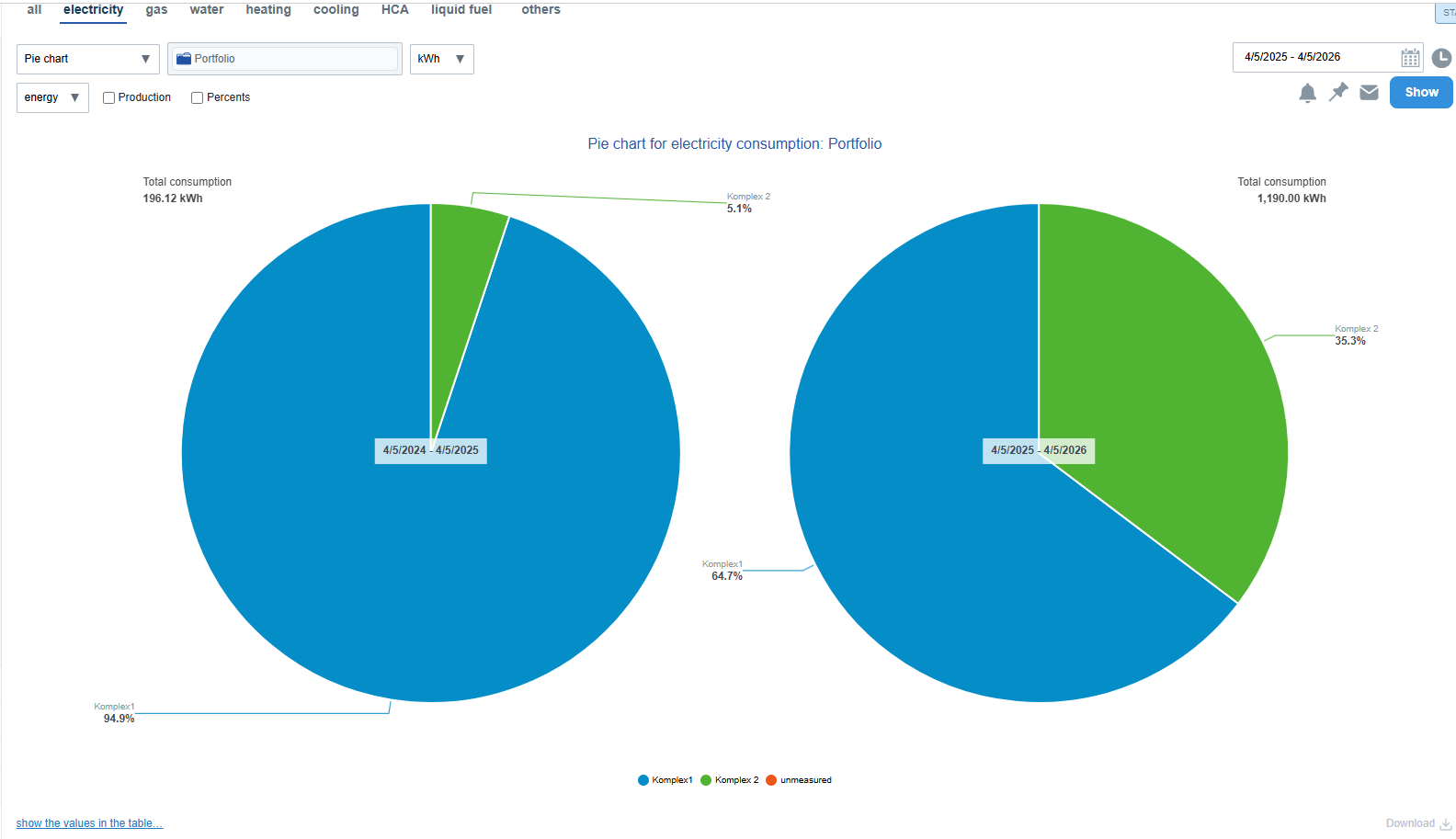
Comparison Mode
The chart can be displayed in comparison mode (e.g. current vs. previous period). Two charts are shown side by side:
- left = older period
- right = current period
Navigation preserves the comparison mode.
State Persistence and Sharing
The current chart state (selected level) is stored in the URL – opening the link will display the same view.
Tip: Click on a slice → drill down. Click outside the chart → go back. If a slice does not respond, it has no further level.
Heat maps
Heat maps are a useful way to quickly see the consumption (or cost) profile of a week or other recurring time period.
Values are plotted using a colour spectrum, allowing for quick comparison of large amounts of data. The shade of the rectangle in the map shows the size of the consumption (load) according to the following legend, which is displayed below the map.

The scale is scaled according to the values in the selected time period. In this case, "79.76" represents the highest value in the selected time period.
The map is displayed as an area, where the Y-axis shows the days and the X-axis shows the hours of the day.
An example of a typical heat map showing the consumption of one building during one day could be as follows:
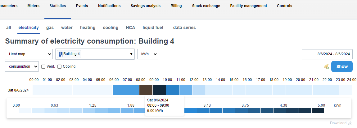
The graph shows that in this case, the most electricity is consumed in Building 4 between the eight and ninth hours.
If you place the mouse cursor over the square, the exact consumption/cargo value is displayed.