Data series
You can view the data series on the Statistics tab by clicking on the data series box on the right side of the top panel showing the energy types.
Select your desired data series from the menu (there can be more than one) and select the time span.
You can display only one type of data series (binary, continuous, discrete). You cannot display data series of the same type that have three or more different units.
Comparison with Previous Year in DS Charts
- Activation: The comparison option can be enabled using a checkbox. Once selected, data from the previous year will be displayed alongside the current year's data.
- Support: The feature is available for cDS and dDS charts, but not for bDS or HM charts.
- Limitations: Comparison is limited to one year and depends on the availability of data for the selected range.
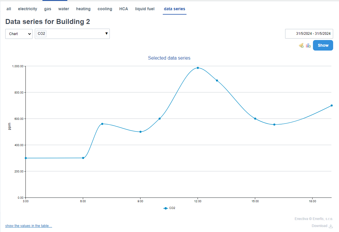
Continuous data series
Continuous data series (e.g. CO2, temperature) are represented in the statistics by dots and a curve representing the trend line.
Example: by displaying the daily trend of the carbon dioxide concentration in a room, we can see at what hours during a normal operating day the level rises above the healthy limit. You can view the daily CO2 waveform by selecting a specific data series from the data series menu, clicking in the time range box, and selecting the specific day option.
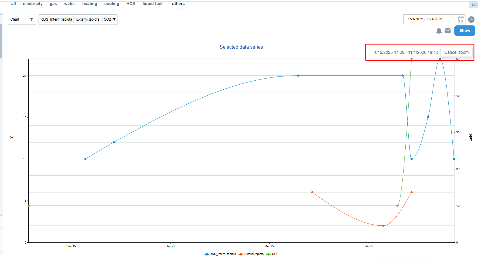
Zooming in the chart
To explore a specific part of the graph in more detail, you can use the zoom function:
- Move your cursor to the start of the desired range in the chart.
- Click and drag horizontally to the right or left.
- The selected range will be highlighted, and the chart will automatically zoom in to show only that portion.
- A box in the upper right corner displays the selected range and a Cancel zoom button to return to the original view.
The zoom works, even when displaying multiple continuous data series at once.
If the data density is high, the system will fetch more detailed data from the server and render it accordingly.
Zooming does not affect the date range in the calendar or the page URL.
Discrete data series
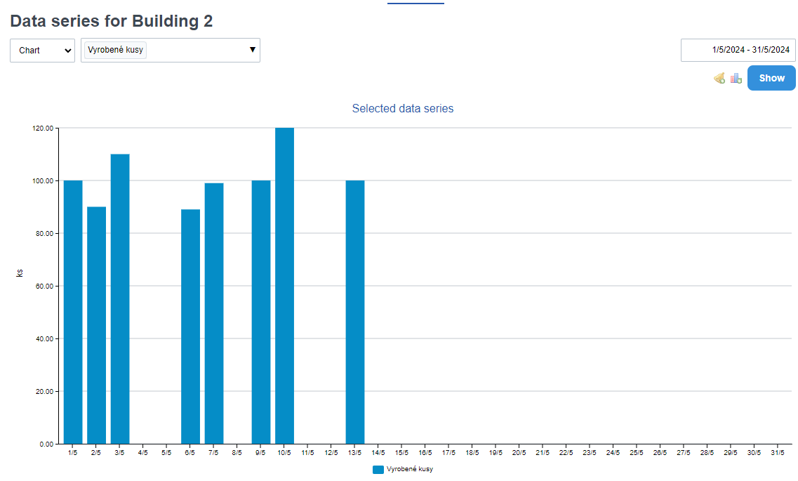
Discrete data series monitor a discrete discontinuous world, so they can be easily displayed in a typical bar chart.
Example: we want to display the number of units of a product that has been produced since the beginning of the month. Therefore, we go to Statistics -> Data Series and select "Units produced" and specify the time period. We will see a similar graph:
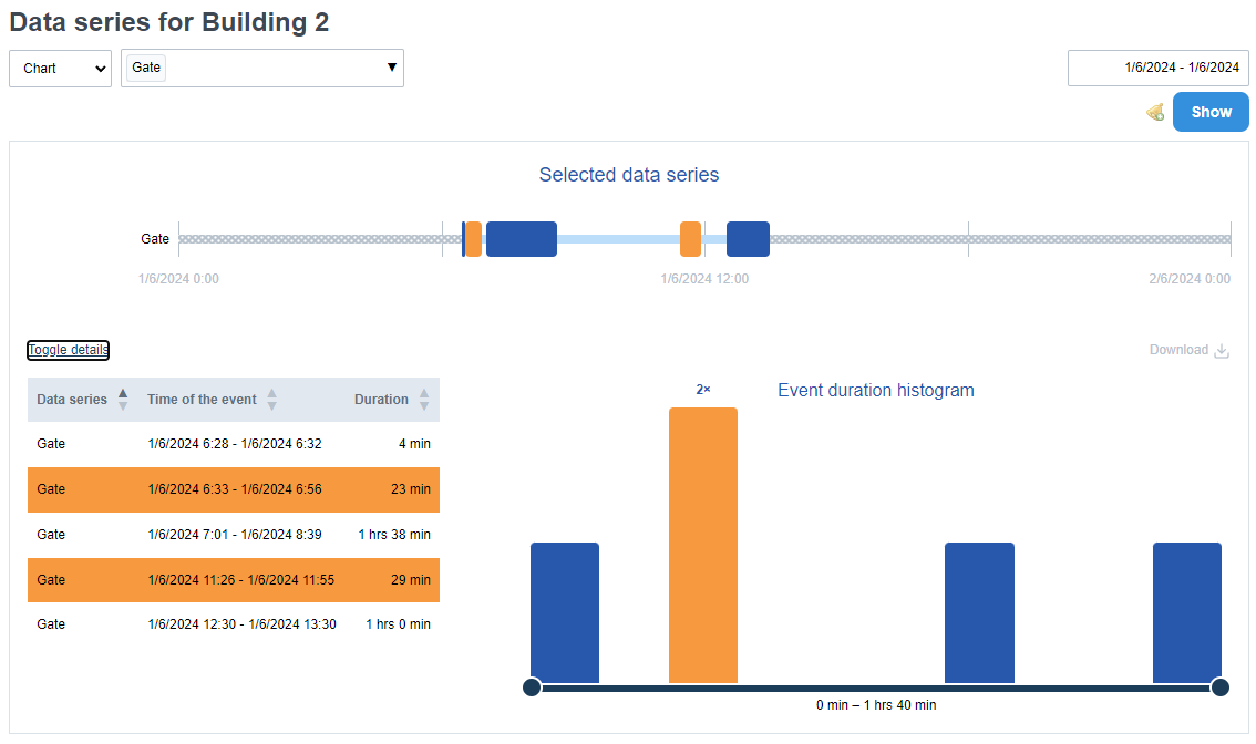
Binary data series
Graphs describing binary data series differ from the previous types. They are used to monitor two states, typically off/on and the time the state lasts. E.g. length of time the lights are on, length of time the door/door is open, etc.
After you have selected a specific data series to display and time period, click View.
Here you can see the timeline where the monitored value (see Creating data series) is displayed as columns whose height is determined by the duration of the value. When you hover over a column, a window appears describing how long the event lasted, the exact time period, and the reliability of the data (i.e., number of data points/number of expected data points based on the import period) if you have checked the automatic import.
The table contains individual events that can be sorted according to three parameters:
- Name of the data series
- Time of the event
- Duration
The histogram has a maximum of 13 groups" that divide events according to their duration. The last group contains all events whose duration is longer than 2 hours.
You can filter the data displayed in the table by moving the sliders located at the edge of the histogram.
Example: by displaying a binary series of open or closed doors to a building, you can see how often this event occurs during the day and how it can affect the heat leakage from the building leading to increased consumption.