Detailed Information About Statistics in Charts
What the Statistics display:
Statistics add valuable insights to the charts, enabling users to analyze the data being displayed. Key metrics include:
- Basic Statistics for Displayed Data Series:
- Minimum: The lowest value within the displayed time period.
- Maximum: The highest value within the displayed time period.
- Average: The average value of the data series for the entire period.
- Delta (Min-Max Delta): The difference between the highest and lowest values.
- Additional Statistics Based on the Type of Time Axis:
- Hourly Statistics:
- Night Avg: The average value during night hours (from 20:00 to 6:00).
- Day Hour Avg: The average value for individual daytime hours.
- Daily Statistics:
- Work Day Avg: The average value for workdays, excluding holidays.
- Day Off Avg: The average value for non-working days.
- Monthly and Annual Statistics:
- Total: The total sum for the selected period (month or year).
- Hourly Statistics:
How it works:
- Displaying Statistics in Charts:
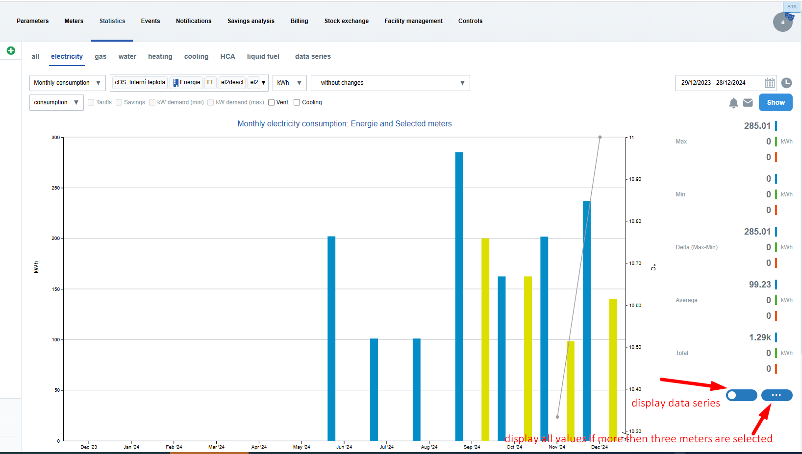
- Statistics are displayed in the right-hand panel next to the chart.
- Each data series has its own set of statistics (e.g., consumption, costs, CO₂ emissions).
- If more than three data series are present in the chart, detailed statistics are shown in a dialog box upon clicking a button.
- Interactive Features:
- Hover and Click: When hovering the mouse over a specific data point (e.g., minimum, maximum), the corresponding value is highlighted in the chart.
- Toggles: Users can toggle between different metrics, such as displaying a specific meter or data series.
- Support for Various Chart Types:
- Statistics are available only for periodic charts with a time axis (e.g., monthly or daily consumption).
- Statistics are not available for comparison charts or overview charts on the dashboard.
- Specifics for cDS and dDS:
- Statistics include cDS (calculated data series) and dDS (direct data series).
- For cDS, only average values are displayed (minimum and maximum values are excluded in advanced statistics).
User experience:
- Colors and Clarity: Each metric (minimum, average, maximum) is color-coded for easy identification.
- Tooltips: Provide explanations and detailed descriptions of the displayed values.
Notes and limitations:
- Statistics are calculated only based on the available data for the displayed period. If data is unavailable (e.g., for a specific month), the charts will reflect this.
- Charts update dynamically based on the selection of metrics or data series, allowing users to obtain more precise analyses.