All
In the All column, you can find various graphs to show total energy consumption or costs, specifically:
- All energies
- Monthly energy costs
- Total costs in % for each energy
- Development of costs for individual energies
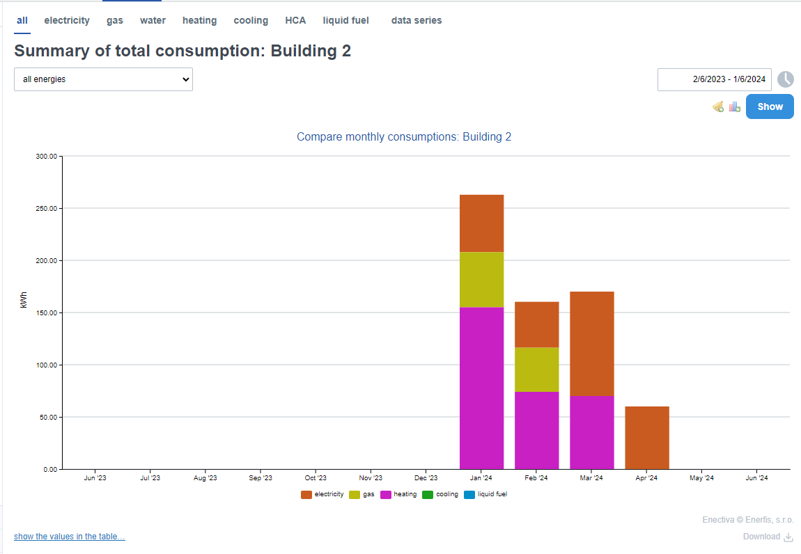
All energies
This chart is a simple representation of energy consumption using bar charts. It makes it easy to compare individual energies with precise data. The meters belonging to the displayed entity are taken as the source of the individual energy consumption.
Select the range of the area to be displayed and click View. You can navigate the chart in a similar way to the Monthly Consumption chart.
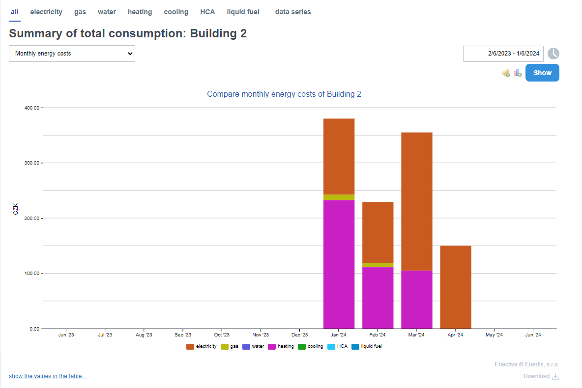
Monthly energy costs
This type of graph is very similar to the previous one, but the difference is that instead of consumption you compare costs. You can easily see which energy you are paying the most for in a year/month/week etc.
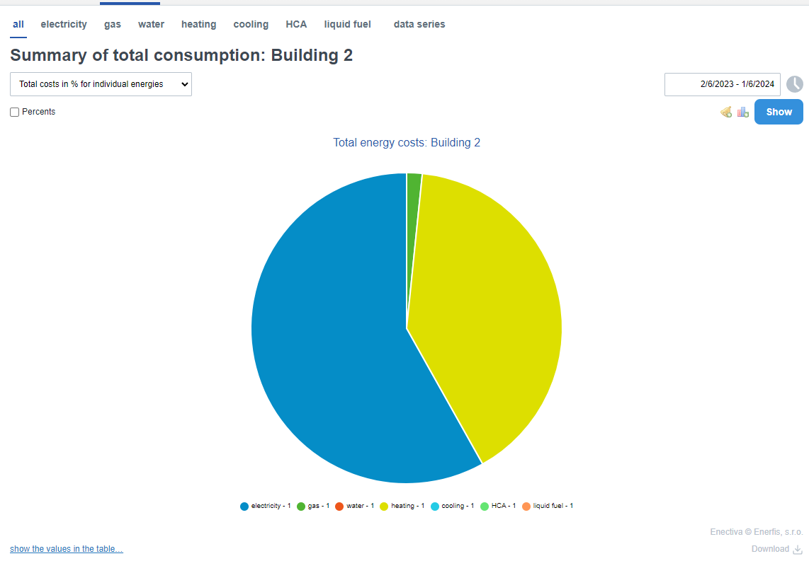
Total costs in % for each energy
To view total costs in a pie chart, choose this chart type. In it, you will see what energy you paid the most for over the selected period.
You can view individual costs either directly in Crowns or as a percentage by ticking the percentage box.
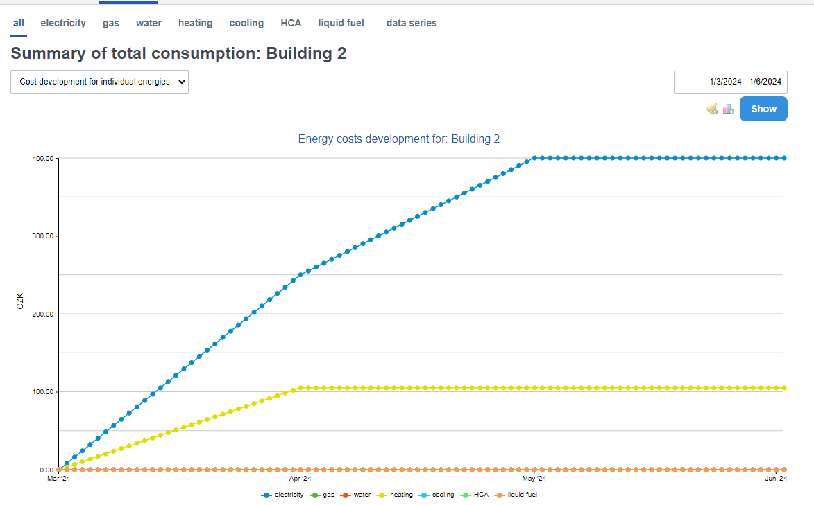
Development of costs for individual energies
Here you can see how the total cost of each energy increases over the selected period. The biggest advantage of this type of graph is that you can easily see rising costs and immediately analyse fluctuations in the consumption trend.